|
Recently, Instagram reached 300 million active users, including a 50% growth from just nine months ago. The most distinctive feature of Instagram is the standard square format for posting photographs, art, text, or just about anything. With so many active users embracing Instagram as a visual form of communication, the square format has become a standard by which we see things. In short, Instagram has played an instrumental role in shaping our aesthetic sensibility, in regards to how we see, frame, and construct the visual world. As a museum professional, I find this development to be intriguing and significant in light of how we have traditionally viewed works of art. For centuries, the rectangle dominated our field of vision. Whether you are looking at renaissance paintings by Raphael and Michelangelo, baroque paintings by Rembrandt and Caravaggio, Rocco paintings by Fragonard and Watteau, 19th century works of Ingres and Monet, or modern paintings by Picasso and Jackson Pollock, the vertical and horizontal formats shape our understanding and appreciation of those works. The most pervasive celebration of the rectangle occurs in cinema, with the aspect ratio forever widening our field of vision to encompass more of the periphery. Instagram, on the other hand, challenges the hegemony of the rectangle. Instagram’s use of the square format is not a new paradigm as far as photography is concerned. In years past, photographers used square formatted film cameras like the double and single lens reflex cameras, Rolleiflex and Hasselblad, to capture beautifully composed photographs that rival any art form defined by the ubiquitous rectangle. Square formatted cameras were great for documenting everyday life and were the preferred choice of photographers who covered events for major news outlets. Yet, one can argue that Instagram brought the square formatted camera into the mainstream of our aesthetic consciousness. 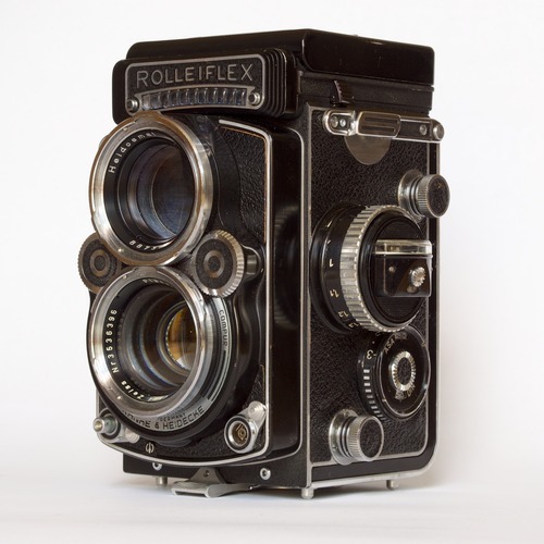 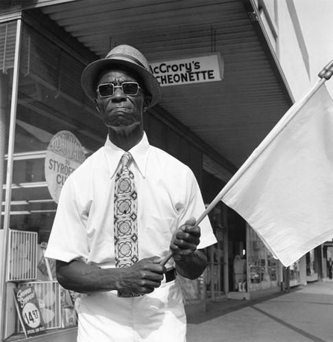
Left: Rollieflex Twin Lens Camera; Right: Raymond Smith, Street Corner Preacher, Savannah, Georgia, 1974, silverprint. Instagram debuted in October 2010 and rapidly gained in popularity. In less than two years, the company claimed over 100 million active users. Recognizing this paradigm shift in the way users shared and consumed images, Facebook purchased the company in April of 2012. Since then, Instagram greatly exceeded Facebook in year-to-year growth, with a 23% increase in 2013 compared to 3% for Facebook. Now that Instagram has reached 300 million users, it is safe to say that the “square is the new rectangle.” The Shape of Things to Come In 2013, Apple unveiled a radical new design for the iPhone with the release of iOS 7. Along with the new flat design, Apple introduced the square camera mode, as an alternative to the normal 4:3 and 16:9 aspect ratios - a direct response to Instagram’s popularity. Now, with mobile phones glued to the palm of our hands, the square format is now immediately available as our aesthetic weapon of choice. The Square is Just Another Rectangle The square and rectangle are quadrilaterals and parallelograms, so a square is just a version of a rectangle. If that’s so, shouldn’t the same rules of composition apply to both formats? Not necessarily. For centuries, the rectangle has been used as a standard framework for structuring our field of vision. The rectangle compels the viewer to look up and down when viewing a picture vertically, and side to side when viewing it horizontally. As a result, the rectangle compels the viewer to find corresponding elements within the picture to complete the narrative. The square however follows a different trajectory. Rather than go from side to side or up and down, the field of vision follows the path of a circle; it centralizes your content, irrespective of where it’s placed within the picture. The Rule of Thirds Most people would agree that there is an art to taking a good photograph. This art is guided by organizing principles of design to help establish a structured and more harmonious composition. The rule of thirds is an organizational framework for dividing your picture into three sections, vertically and horizontally. Objects in space, including structures that run parallel to the picture plane (horizon line or table e.g.) are aligned with these guides, in some cases, placed at junctures where the vertical and horizontal lines meet. The guides are useful when objects are placed flush left or right or when the eye level is above or below. The basic logic of this system takes into account the vertical and horizontal lines that define the window through which we see things. If objects are placed parallel or relative to those lines (the boundaries of your picture), your composition is more likely to be more pleasing and natural to the eye. The grid lines appear by default when you launch the Instagram app and the iPhone provides this option in the settings menu. Source: www.photographymad.com This rule makes perfect sense in the case of the rectangle, following a tradition that gave us the golden ratio and Fibonacci systems, which have existed since the renaissance. Yet, can we apply the rule of thirds to a square format? Yes and no. The Rules of Instagram In short, there are no rules. Instagram provides the ideal format for presenting any subject you desire the way you see fit, while the grid is available if you need it. Yet, there are some posts that seem to capture our attention in ways that do not necessarily abide by a single rule. Rather than view design principles as rules that you MUST follow, I propose that you consider the following as suggested guidelines for taking your Instagram posts to the next level. 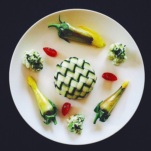
(above) Instagram User: chinamisakamoto Symmetry Since a square has equal sides, the most reliable design principle for creating a compelling Instagram post is symmetry. Symmetry involves the use of corresponding elements that balance the composition. Guided by a central axis, vertical or horizontal, elements are placed on each side of the picture (left/right, top/bottom) to create a mirror image or representation. Both sides appear identical, allowing for subtle variations and distinctions without disturbing the overall symmetry of the design. Of course, the most common, and, arguably, most effective approach on Instagram is the use of a circular shape placed directly in the center of the picture. 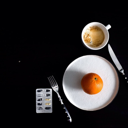
(Above) Instagram User: ladyandpups Asymmetry Asymmetry can be used to vary both sides of a composition (e.g. you may have two small objects on one side of your picture and one large object on the other, or one object on one side and nothing on the other). In short, asymmetry avoids the use of a mirror image. However, asymmetry does not mean that a composition is devoid of balance. The size of an object can be compensated by a change in weight or density, offering a lighter or darker tonality. The “absence” of an object (e.g. a solid background) can also imply the “presence” of one, creating a balance that is more suggestive. Occasionally, you will find an Instagram post where a single image is placed in the corner of the picture, leaving the rest of the space empty. Solid backgrounds Some of the most beautiful Instagram images I’ve encountered make use of a white or black background. Unlike pictures taken in situ (original place), some Instagrammers choose to manipulate the background by using apps to erase it or use objects with transparent backgrounds and adding them to solid layers. By eliminating extraneous elements, your subject takes center stage and commands your viewer’s attention. Apps that make use of layers include Adobe Photoshop Touch and Leonardo, among others. Light and Shadow Instagram appeals to our sense of immediacy, so it’s easy to overlook the power of light and shadow. Lighting can add drama to your photos, reinforce a focal point, while subduing other areas. A stark contrast between lights and darks can also flatten your picture and blur the boundaries between objects, creating surprisingly effective patterns of light that envelope the entire image. Light and shadow thereby become the unifying elements of a picture, especially when your composition lacks balance or visual appeal. (Above) Instagram User: bonnietsang Depth of Field Another common technique for creating dynamic Instagram shots is the use of depth of field to create distance. There are many approaches to DOF when using a mobile phone. For example, Instagram includes the Tilt-Shift tool, with radial and linear options for blurring sections of your photos. The former can be used to place greater focus on a person in the foreground, while the latter can be used to enhance the distance in a landscape or street scene. Another variant of DOF is perspective. 
(Above) Instagram User: wolvestable Perspective The linear and geometric boundaries of the camera compel us to take photos of images that are parallel to the edges of the frame. Yet a change in perspective can add dynamism to your photos and capture the interest of the Instagram community. The most popular example found on Instagram is the camera tilted downwards at your feet. This simple technique disrupts your normal field of vision, creating the illusion of linear distance within a square format that is primarily cyclical. In some examples, the photographer will choose to stand on a cliff, adding depth of field to heighten the perspective. The more classic approach to perspective involves the use of one point perspective, in which everything appears to converge at one point in the distance. (Above) Instagram User: mrpaddingtonbear Cropping Most of us desire to create an attractive and pleasing image. In doing so, we want our subject to be seen in all its splendor. Yet, as far back as the 19th century, the cropped image was seen in direct correlation to the fleeting realities of modern life. This reality has been amplified a thousand-fold today, so cropping will undoubtedly have a much stronger appeal. The most common use of this technique on Instagram includes the dual use of perspective that captures the bottom half of someone’s legs and feet, often placed diagonally from the corner of the picture. This technique is also ubiquitous among chef’s and culinary professionals who present three quarters of a plate, forming an arc across the picture frame. This approach also makes use of asymmetry, which ironically appears perfectly balanced. 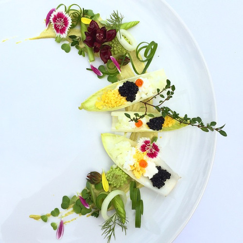
(Above) Instagram User: royalebrat Lend a Hand Consistent with the use of extended legs, fragments of the human body add a human element to your arrangements. In many Instagram posts, hands extend into the picture (usually holding an object), forming the central axis and focal point around which various objects are situated. Since the hand is divorced from a recognizable body, the hand functions as an invitation for you to join in. 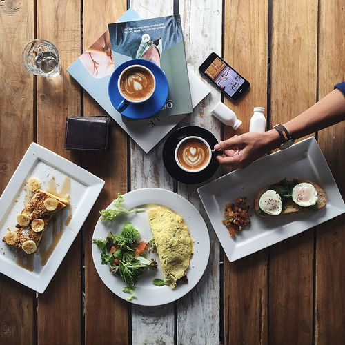
(Above) Instagram User: grungeee Aerial View Views from above are quite common on Instagram, mainly because they provide a way to view your composition as a flat two dimensional design. Formal elements like shape, line, pattern, and color are used to structure the composition. If you are looking to highlight a special recipe or priceless possession, or capture a special moment in time, designing your picture from above can add elegance to your Instagram posts. 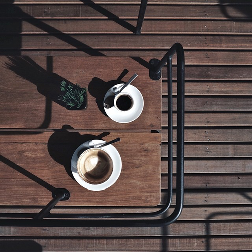
(Above) Instagram User: reinaldo The camera lens can also be used to capture patterns that are inherent in nature or expressed through man-made structures. There are a number of Instagrammers who focus on patterns as a primary feature of their work. While many of the images are derived from specific places, the photographs reveal patterns of light and color that emphasize their formal quality, which transforms normal depictions into works of art. Pictorial Elegance Most of the techniques mentioned above are used during the photographic process. Yet, there are some Instagrammers who are chefs, fashion designers, illustrators, digital, and graffiti artists. As a result, some people may spend more time composing their images before they are imported into Instagram; or artists may prepare their art to be viewed in a multi-faceted way, designing content for clients in one instance, while reformatting or re-presenting their work for Instagram. 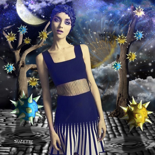
(Above) Instagram User: allthingssuzette Instagram’s popularity is largely due to its accessibility and ease of use. Regardless of region, age, gender, profession, experience, and technical ability, Instagram has value for everyone. One may even argue that the square format contains a quality of universality. Whether one is apt to post a flattering selfie, or compose an elegant picture, the square is the new rectangle. Author: Timothy Paul Brown
0 Comments
Leave a Reply. |
AuthorMuseum Educator and Tech Blogger Archives
July 2020
Categories
All
|
 RSS Feed