|
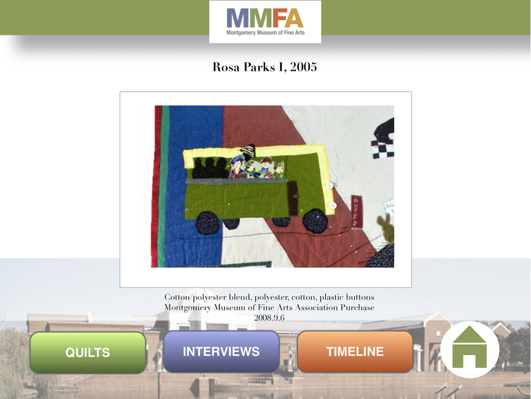
One of the most rewarding I experienced at the Montgomery Museum of Fine Art was having the opportunity to work with Yvonne Wells. Wells is an African American artist and quiltmaker out of Tuskaloosa, Alabama. The MMFA owns a number of her quilts and offers a traveling exhibition called "From Heart to Hand: African American Quilts from the Montgomery Museum of Fine Arts." I first met Wells while working on an education component for the exhibition "Piecing Together History: The Civil Rights Quilts of Yvonne Wells." The education component consisted of a web-based interactive project created in html5, but stored locally on the iPad to serve as a kiosk. The project can also be viewed on the web, although the dimensions of this project were designed to be featured exclusively on the iPad (the website is not responsive, so it may be hard to appreciate on smaller mobile devices). This project consisted of various recordings featuring Yvonne Wells talking about select quilts in the exihbition, which documented her personal reflections of the civil rights movement. The recordings were made by the Museum's curatorial department, which I edited and combined with images to form animated video slideshows. Each video pans and zooms to focus on different features of the quilts as Wells describes them. The project also included four video interviews with the artist, some of which were produced by the curatorial staff, while others were taken from rare video footage with the artist (in the version that is currently online, I substituted those videos for interviews I conducted for a later project). To strengthen the education component, I added a timeline of the Civil Rights Movement, as documented by the Southern Poverty Law Center, a timeline of events that was also referenced in the Civil Rights Memorial designed by Maya Lin. The project was rewarding on so many levels. For one, I had a chance to work with a living artist, which is always a rewarding experience, and I had a chance to partner with the curatorial department in a way that felt more integral to the overall development of the exhibition.
I was fortunate enough to revisit my journey into the life of Yvonne Wells when the MMFA decided to feature an exhibition of photographs by Jerry Siegel titled "Creator/Created: Jerry Siegel Portraits and Artists from the Permanent Collection." In my effort to strengthen the educational components of the exhibition, I proposed to conduct video interviews with the artists featured in the exhibition, many of whom were still alive and living in Alabama and Georgia. This project required that I visit the home of Yvonne Wells to conduct a video interview that documented her life and development as a quilt maker. Traveling with a camcorder, light stands and remote microphones, I conducted the interview in her living room to create an organic and homegrown atmosphere. I felt that we needed more visuals, so Wells graciously agreed to set up a large quilt behind her. Since Wells worked as a teacher and educator for many years, it was not surprising to hear how astute and articulate she was at describing her development as an artist and her passion for quiltmaking, which she described as "art." The videos that I recorded during this meeting were added to the Museum's YouTube channel and were later added to this online version which I posted years later. The project for the Jerry Siegel exhibition also included video interviews with 15 other artists, including Cal Reed, Charlie Lucas, and Dale Lewis, to name a few. Eventually, the videos were incorporating into iPad interactive kiosks that were installed in the exhibition, along with the photographs by Jerry Siegel. The kiosk also included additional photographs by Siegel that were not included in the exhibition and documentary footage of Siegel working with high school students during a photography workshop. It was such a pleasure to interview the artists in the Montgomery Museum's collection and I will always cherish the opportunity to meet Yvonne Wells. Recently, Instagram reached 300 million active users, including a 50% growth from just nine months ago. The most distinctive feature of Instagram is the standard square format for posting photographs, art, text, or just about anything. With so many active users embracing Instagram as a visual form of communication, the square format has become a standard by which we see things. In short, Instagram has played an instrumental role in shaping our aesthetic sensibility, in regards to how we see, frame, and construct the visual world. As a museum professional, I find this development to be intriguing and significant in light of how we have traditionally viewed works of art. For centuries, the rectangle dominated our field of vision. Whether you are looking at renaissance paintings by Raphael and Michelangelo, baroque paintings by Rembrandt and Caravaggio, Rocco paintings by Fragonard and Watteau, 19th century works of Ingres and Monet, or modern paintings by Picasso and Jackson Pollock, the vertical and horizontal formats shape our understanding and appreciation of those works. The most pervasive celebration of the rectangle occurs in cinema, with the aspect ratio forever widening our field of vision to encompass more of the periphery. Instagram, on the other hand, challenges the hegemony of the rectangle. Instagram’s use of the square format is not a new paradigm as far as photography is concerned. In years past, photographers used square formatted film cameras like the double and single lens reflex cameras, Rolleiflex and Hasselblad, to capture beautifully composed photographs that rival any art form defined by the ubiquitous rectangle. Square formatted cameras were great for documenting everyday life and were the preferred choice of photographers who covered events for major news outlets. Yet, one can argue that Instagram brought the square formatted camera into the mainstream of our aesthetic consciousness.  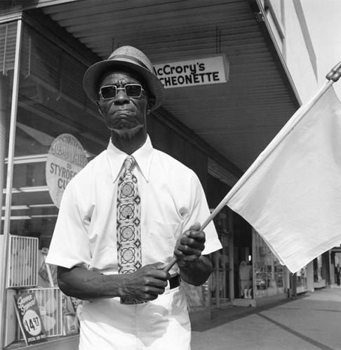
Left: Rollieflex Twin Lens Camera; Right: Raymond Smith, Street Corner Preacher, Savannah, Georgia, 1974, silverprint. Instagram debuted in October 2010 and rapidly gained in popularity. In less than two years, the company claimed over 100 million active users. Recognizing this paradigm shift in the way users shared and consumed images, Facebook purchased the company in April of 2012. Since then, Instagram greatly exceeded Facebook in year-to-year growth, with a 23% increase in 2013 compared to 3% for Facebook. Now that Instagram has reached 300 million users, it is safe to say that the “square is the new rectangle.” The Shape of Things to Come In 2013, Apple unveiled a radical new design for the iPhone with the release of iOS 7. Along with the new flat design, Apple introduced the square camera mode, as an alternative to the normal 4:3 and 16:9 aspect ratios - a direct response to Instagram’s popularity. Now, with mobile phones glued to the palm of our hands, the square format is now immediately available as our aesthetic weapon of choice. The Square is Just Another Rectangle The square and rectangle are quadrilaterals and parallelograms, so a square is just a version of a rectangle. If that’s so, shouldn’t the same rules of composition apply to both formats? Not necessarily. For centuries, the rectangle has been used as a standard framework for structuring our field of vision. The rectangle compels the viewer to look up and down when viewing a picture vertically, and side to side when viewing it horizontally. As a result, the rectangle compels the viewer to find corresponding elements within the picture to complete the narrative. The square however follows a different trajectory. Rather than go from side to side or up and down, the field of vision follows the path of a circle; it centralizes your content, irrespective of where it’s placed within the picture. The Rule of Thirds Most people would agree that there is an art to taking a good photograph. This art is guided by organizing principles of design to help establish a structured and more harmonious composition. The rule of thirds is an organizational framework for dividing your picture into three sections, vertically and horizontally. Objects in space, including structures that run parallel to the picture plane (horizon line or table e.g.) are aligned with these guides, in some cases, placed at junctures where the vertical and horizontal lines meet. The guides are useful when objects are placed flush left or right or when the eye level is above or below. The basic logic of this system takes into account the vertical and horizontal lines that define the window through which we see things. If objects are placed parallel or relative to those lines (the boundaries of your picture), your composition is more likely to be more pleasing and natural to the eye. The grid lines appear by default when you launch the Instagram app and the iPhone provides this option in the settings menu. Source: www.photographymad.com This rule makes perfect sense in the case of the rectangle, following a tradition that gave us the golden ratio and Fibonacci systems, which have existed since the renaissance. Yet, can we apply the rule of thirds to a square format? Yes and no. The Rules of Instagram In short, there are no rules. Instagram provides the ideal format for presenting any subject you desire the way you see fit, while the grid is available if you need it. Yet, there are some posts that seem to capture our attention in ways that do not necessarily abide by a single rule. Rather than view design principles as rules that you MUST follow, I propose that you consider the following as suggested guidelines for taking your Instagram posts to the next level. 
(above) Instagram User: chinamisakamoto Symmetry Since a square has equal sides, the most reliable design principle for creating a compelling Instagram post is symmetry. Symmetry involves the use of corresponding elements that balance the composition. Guided by a central axis, vertical or horizontal, elements are placed on each side of the picture (left/right, top/bottom) to create a mirror image or representation. Both sides appear identical, allowing for subtle variations and distinctions without disturbing the overall symmetry of the design. Of course, the most common, and, arguably, most effective approach on Instagram is the use of a circular shape placed directly in the center of the picture. 
(Above) Instagram User: ladyandpups Asymmetry Asymmetry can be used to vary both sides of a composition (e.g. you may have two small objects on one side of your picture and one large object on the other, or one object on one side and nothing on the other). In short, asymmetry avoids the use of a mirror image. However, asymmetry does not mean that a composition is devoid of balance. The size of an object can be compensated by a change in weight or density, offering a lighter or darker tonality. The “absence” of an object (e.g. a solid background) can also imply the “presence” of one, creating a balance that is more suggestive. Occasionally, you will find an Instagram post where a single image is placed in the corner of the picture, leaving the rest of the space empty. Solid backgrounds Some of the most beautiful Instagram images I’ve encountered make use of a white or black background. Unlike pictures taken in situ (original place), some Instagrammers choose to manipulate the background by using apps to erase it or use objects with transparent backgrounds and adding them to solid layers. By eliminating extraneous elements, your subject takes center stage and commands your viewer’s attention. Apps that make use of layers include Adobe Photoshop Touch and Leonardo, among others. Light and Shadow Instagram appeals to our sense of immediacy, so it’s easy to overlook the power of light and shadow. Lighting can add drama to your photos, reinforce a focal point, while subduing other areas. A stark contrast between lights and darks can also flatten your picture and blur the boundaries between objects, creating surprisingly effective patterns of light that envelope the entire image. Light and shadow thereby become the unifying elements of a picture, especially when your composition lacks balance or visual appeal. (Above) Instagram User: bonnietsang Depth of Field Another common technique for creating dynamic Instagram shots is the use of depth of field to create distance. There are many approaches to DOF when using a mobile phone. For example, Instagram includes the Tilt-Shift tool, with radial and linear options for blurring sections of your photos. The former can be used to place greater focus on a person in the foreground, while the latter can be used to enhance the distance in a landscape or street scene. Another variant of DOF is perspective. 
(Above) Instagram User: wolvestable Perspective The linear and geometric boundaries of the camera compel us to take photos of images that are parallel to the edges of the frame. Yet a change in perspective can add dynamism to your photos and capture the interest of the Instagram community. The most popular example found on Instagram is the camera tilted downwards at your feet. This simple technique disrupts your normal field of vision, creating the illusion of linear distance within a square format that is primarily cyclical. In some examples, the photographer will choose to stand on a cliff, adding depth of field to heighten the perspective. The more classic approach to perspective involves the use of one point perspective, in which everything appears to converge at one point in the distance. (Above) Instagram User: mrpaddingtonbear Cropping Most of us desire to create an attractive and pleasing image. In doing so, we want our subject to be seen in all its splendor. Yet, as far back as the 19th century, the cropped image was seen in direct correlation to the fleeting realities of modern life. This reality has been amplified a thousand-fold today, so cropping will undoubtedly have a much stronger appeal. The most common use of this technique on Instagram includes the dual use of perspective that captures the bottom half of someone’s legs and feet, often placed diagonally from the corner of the picture. This technique is also ubiquitous among chef’s and culinary professionals who present three quarters of a plate, forming an arc across the picture frame. This approach also makes use of asymmetry, which ironically appears perfectly balanced. 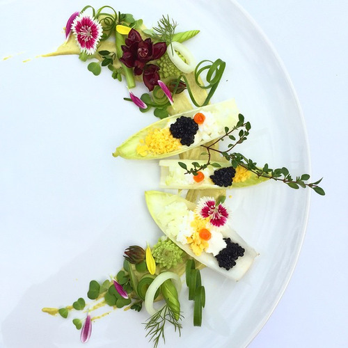
(Above) Instagram User: royalebrat Lend a Hand Consistent with the use of extended legs, fragments of the human body add a human element to your arrangements. In many Instagram posts, hands extend into the picture (usually holding an object), forming the central axis and focal point around which various objects are situated. Since the hand is divorced from a recognizable body, the hand functions as an invitation for you to join in. 
(Above) Instagram User: grungeee Aerial View Views from above are quite common on Instagram, mainly because they provide a way to view your composition as a flat two dimensional design. Formal elements like shape, line, pattern, and color are used to structure the composition. If you are looking to highlight a special recipe or priceless possession, or capture a special moment in time, designing your picture from above can add elegance to your Instagram posts. 
(Above) Instagram User: reinaldo The camera lens can also be used to capture patterns that are inherent in nature or expressed through man-made structures. There are a number of Instagrammers who focus on patterns as a primary feature of their work. While many of the images are derived from specific places, the photographs reveal patterns of light and color that emphasize their formal quality, which transforms normal depictions into works of art. Pictorial Elegance Most of the techniques mentioned above are used during the photographic process. Yet, there are some Instagrammers who are chefs, fashion designers, illustrators, digital, and graffiti artists. As a result, some people may spend more time composing their images before they are imported into Instagram; or artists may prepare their art to be viewed in a multi-faceted way, designing content for clients in one instance, while reformatting or re-presenting their work for Instagram. 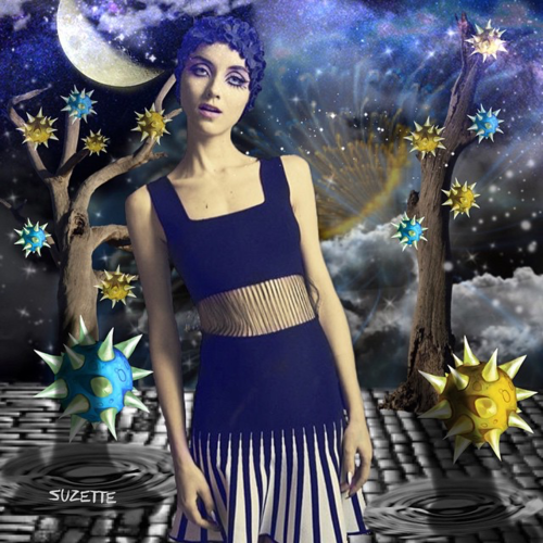
(Above) Instagram User: allthingssuzette Instagram’s popularity is largely due to its accessibility and ease of use. Regardless of region, age, gender, profession, experience, and technical ability, Instagram has value for everyone. One may even argue that the square format contains a quality of universality. Whether one is apt to post a flattering selfie, or compose an elegant picture, the square is the new rectangle. Author: Timothy Paul Brown
Podcasts
Podcasts offer a convenient way to deliver digital content for free via a subscription to a web feed, and Soundcloud provides a cloud-based delivery system for streaming audio content straight from a browser. Actually, Soundcloud provides a way to do both. Before I begin, let me provide you with a little background about podcasting. Not surprisingly, Apple played a key role popularizing podcasts, and podcasters like Adam Curry, otherwise known as the "podfather," was one of the first to use the technology. iTunes was introduced at Macworld on January 9, 2001, after Apple purchased SoundJam MP, from the developers (and former Apple employees) Jeff Robbin, Bill Kincaid, and Dave Heller. On June 28, 2005, Apple introduced iTunes version 4.9 which offered built-in support for podcasts.
What exactly is a podcast?
A podcast is a form of digital media (audio, video, digital radio, pdf) that is presented in a series and streamed online to a computer or mobile device. The podcast producer maintains a list of digital files or assets on a server as a web feed that can be accessed by third-party software like iTunes, which functions as a directory for accessing the podcasts - otherwise known as an “aggregator” or “podcatcher.” Web feeds are set up using RSS (Really Simple Syndication), an XML file format that ensures compatibility with many different computers, devices, and programs. RSS feeds enable users to subscribe to audio and video recordings and receive them in a series, automatically, removing the need to manually check the website for new content. For example, when you open iTunes on your computer, you will find podcasts as a menu option, alongside music and movies. When you access podcasts from the iTunes Store, you will find a directory of podcasts that you can browse by categories, including highlighted sections like “new and noteworthy” or “featured collections.” Soundcloud was established in Berlin in August 2007 by a Swedish sound designer Alexander Ljung and Swedish artist Eric Wahlforss. Soundcloud provides an online resource for accessing music and audio recordings directly from a browser. Content producers are provided with individual channels that users can follow, like, repost, and add to customized playlists. Soundcloud can be accessed through a mobile application, which makes it easy to stream recordings from a smartphone. Content that is distributed through Soundcloud can also be shared and distributed through other websites using a code embed option, enabling content producers and consumers to feature songs and playlists across the web. I guess you can say that Soundcloud is like Flickr for audio streaming. Soundcloud provides a convenient way for combining its cloud-based service for hosting and delivering audio content with podcast technology, which automatically delivers content to you. For example, music and audio recordings that are set up on a channel or in a playlist can be selectively added to a RSS feed that is generated by Soundcloud. Soundcloud generates a unique url or RSS feed that can be submitted to “podcatchers” or directories like iTunes. The podcasts or audio recordings are accessed through various applications, including Podcasts by Apple, Overcast, Downcast, Stitcher Radio, and Podcast Addict, to mention a few). Summary The marriage or integration of Soundcloud with podcast technology helps to provide broad access to audio recordings, most of which are free to consumers. Content producers that are interested in using Soundcloud as a delivery system have the option to sign up for a Pro account at $6 a month or a Pro Unlimited account at $15 dollars a month, if they prefer to have advanced access to analytics and web statistics. If you are unfamiliar with podcasting, I recommend that you visit iTunes and explore the directory of podcasts, or check out Apple’s Podcasts application, which comes pre-installed on iPhones. Likewise, if you are unfamiliar with Soundcloud, visit soundcloud.com, search Soundcloud’s directory, download the Soundcloud application, and/or start your own Soundcloud account. You will discover a whole new world of content right at your finger tips. Visual Thinking Strategies or VTS is a teaching model that has been used by museum educators for several decades. Based on the research of Abigail Housen, VTS relies on facilitated discussion to engage students more deeply about art. Questioning StrategiesThe key to using VTS is the questioning strategy that is employed to elicit a broad range of responses, followed by specific observations, and more nuanced interpretations.. What's going on in this painting? What do you see that makes you say that? What more can we find? - these are the core questions that are used to layer the discussion. What's going on in this painting?This is the primary question that is asked to get students engaged about a work of art. It is an open-ended question or divergent question that encourages students to respond in the broadest possible manner. What's going on in this painting? encourages students to respond to a painting as if it were an event or a "happening;" it is very different from the question "what do you see?" which focuses more on description rather than narration. Students learn by telling stories, so this question is important to get the conversation going. What do you see that makes you say that?This question gets students to focus specifically on the painting they are looking at, taking their initial responses, which are primarily subjective, and linking them to the objective facts in the painting. This enables students to make a personal connection to the work of art, while strengthening their observation skills and providing evidential reasoning to support their observations. What more can we find?Willem de Kooning once remarked that "painting is the forever mute part you can talk about forever." The irony in this statement implies that paintings contain stories with endless possibilities. When students are asked to find more, they are encouraged to extend their mental powers to provide more complex and nuanced interpretations. A Democratic ModelVTS is highly valued by educators and parents because it offers an inclusive approach to learning that encourages a wide degree of participation in a group setting. The high level of participation is mediated by the educator or facilitator who paraphrases responses and links answers so that every response becomes a part of a larger narrative. During the process of engagement, students' have an opportunity to learn from each other as the interpretation builds and unfolds; students also feel valued and affirmed as a result of their participation. VTS and the NaysayersVTS is valued by educators but there are many naysayers who feel that it dumbs things down and does not give students an opportunity to learn the "facts," which docents and art historians have spent a life-time studying and preparing.
For years, art historical research has been the basis upon which artworks are interpreted and understood. As education became more integral to how museums engage with the public, especially young audiences, museums began to consider, no only what people learn, but how they learn. Initially, this led to a dichotomous framework that put the learner on one side and what is learned on the other. Thinkers like John Dewey proposed to resolve the dichotomy that separates subjectivity from objectivity by defining "art as experience." This type of research led to a focus on the "process" of learning, superseding the boundaries that separate subjectivity from objectivity. However, like most events that occur in history, developments of this nature do not occur in a linear fashion; they can reoccur at any time. As a result, the debate still exists regarding the value of education as "experience" versus education as the attainment of "facts." VTS is not immune from these conflicts. Over the years, my philosophy of education has evolved to reflect the concerns of the institutions that I've worked at. However, I have never lost sight of the ideas that lie at the foundation of my commitment to public education.
As a graduate student in museum education, I was required to develop a philosophy of teaching that has continued to guide my career as a museum educator. During that time, I identified three primary influences: Paulo Friere, Jurgen Habermas, and John Dewey. Viewing education as a liberatory practice, I was drawn to Paulo Freire ("Pedgogy of the Oppressed") who opposed the "banking deposit" approach to education, advocating the view that education should empower and liberate (what he termed "conscientização" or "critical consciousness." Habermas's ideal notion of the Public Sphere ("The Structural Transformation of the Public Sphere") helped me to envision how education could function in a museum setting, an institution historically committed to public education. The notion of the public sphere has guided my principles regarding teaching models and diverse modes of public engagement. John Dewey ("Art as Experience") helped to inform my understanding of education as a holistic process, embracing a long tradition of American pragmatism. Currently, my philosophy of education has evolved, building on the legacy of John Dewey and taking into consideration more recent studies in museum education and visitor engagement. Dewey’s dialectical approach to education defines the aesthetic experience as something that transcends the subject/object dichotomy, acknowledging the successful integration of the intellect, emotion, and practical experience. The experience embodied in the work of art is replicated by the viewer who undergoes the same transformative experience. Dewey’s Neo-Kantian view, seen through the lens of American pragmatism, thus defines the aesthetic experience as something that transcends the idea of art as an end in itself, and as the means for creating an analogous form of experience. Active looking through a process of questioning, coupled by critical reflection and an emotional investment in the subject lead to practical and constructivist engagements with works of art that can be classified as “experiences.” Dewey’s holistic approach has been adopted by a number of contemporary theorists and philosophers of education who have also defined the aesthetic experience as “flow” or an “autotelic experience” (Mihály Csíkszentmihályi), and other high level forms of engagement like “constructivism.” In order to broaden our understanding of learning in a museum setting, George Hein proposed four models to encompass a range of experiences: Systematic (Didactic), Orderly (Behavioral), Discovery, and Constructivist. The Systematic museum is a didactic model of learning in which information is provided for the learner in the form of labels, catalog entries, and lectures to increase ones knowledge of a subject. The Systematic museum involves a learning setting that is designed and controlled by the educator, in terms of outcomes, but which takes into account the visitor’s response to certain stimuli, thus providing the context for positive reinforcement during the learning process. The Discovery Museum provides a context for further exploration, while still maintaining control over the goals and objectives of the lesson. The learner “discovers” by examining multiple options, embracing subjectivity as a vital part of the learning process, but ultimately arriving at outcomes pre-established by the educator. The Constructivist museum, on the other hand, embraces the idea that the learner is active rather than passive. As Hein explains: “As an educational theory, Constructivism represents the view that learning is an active process in which we as learners make meaning—construct concepts—of the phenomena we encounter. In order to convert sensory input (what we see, hear, feel, and so on) into meaning, we rely on our previous experiences and on our previous meaning making. Thus, everything that we bring with us to any new situation—our culture, language, family background, companions on the visit—influences how we interpret our experience.” In addition to the philosophy and theory of education in an informal learning setting, Falk examines learning in a museum from the standpoint of the visitor. He identifies five types of visitors: Explorers, Facilitators, Experience Seekers, Professional/Hobbyists, and Rechargers. Explorers are motivated by personal curiosity; Facilitators are motivated by other people and their needs (parents/docents); Experience Seekers are motivated by a desire to see and experience (a tourist); Professional/Hobbyist are motivated by the acquisition of knowledge (the scholar); and Rechargers are motivated by a more contemplative experience. In many ways, Falk’s assessment of various visitor types encompasses the models of learning addressed by Dewey and Hein, yet approaches the subject from a visitor’s perspective. The ideas that have shaped my philosophy of education continue to evolve. Although I have devoted more attention to education theory and practice in more recent years, my earlier commitment to education as liberatory (Paulo Frieire) and inclusive (Jurgen Habermas) continue to inform my pedagogy for museum education. Looking Forward As technology continues to transform how we access information and engage visitors with content, I have begun to consider theories of learning and visitor types in the context of digital modes of communication. As I move forward in my development as a museum educator, I will continue to explore the intuitive aspects of touchscreen interfaces, the graphical interface of the web, including the integration of video and multimedia. and other models of learning, such as, e-learning or online learning, user generated content, gaming theory, and "Blended Learning," a varied approach that encompasses traditional face-to-face instruction and digital models of learning. What is beauty and what is sublime?
Kant and Burke can be very perplexing on this subject. On the one hand beauty is defined as having a particular form with identifiable boundaries. The sublime is associated with pain or terror or with that which is boundless. Yet, what does this have to do with aesthetic judgements? For example, let’s take beauty. We find something to be beautiful because it corresponds with our concept of beauty and not because of the sensible qualities associated with the object (i.e. “I love the fragrance of a flower or the taste of a lemon pie). The object is beautiful because of the inherent universality in our judgment. If we rely on our senses to determine that something is beautiful, we then find the object to be not beautiful but “agreeable.” The sublime is tricky, especially when it comes to art. For example, we find something to be sublime because there is nothing in the sensible world that corresponds with the concept of boundlessness. In art, however, the situation is reversed. Because art involves artistic production, its sublimity is defined, not by the concept, but by the lack of available concepts that correspond to the paintings boundlessness or inherent sublimity. In a modern sense, painting strives to become a “pure idea” rather than relying on a pure idea for its own purposiveness. Hmmm. Maybe I need to give this some more thought.
Hype is an exciting html5 editor for the Mac that can be used to create exciting animations. Hype 2.0 introduced new features, including iOS previews, audio actions, curved motion paths, and swipe and touch events.
The iPad is a great device for displaying interactive content, and is therefore the ideal device for kiosk display. Kiosk Pro is the best solution for setting up displays and web-based content on your iPad.
MoMa introduced an iPad application that enables the user to create art inspired by the Museum's permanent collection of modern art. |
AuthorMuseum Educator and Tech Blogger Archives
July 2020
Categories
All
|

 RSS Feed